Brief Introduction to {ggplot2}
This article covers information about the
{ggplot2} package
Basics of plot()
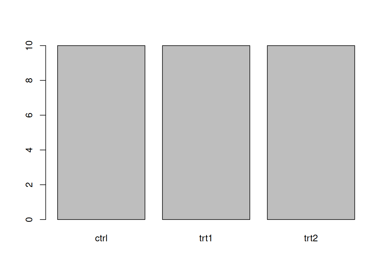
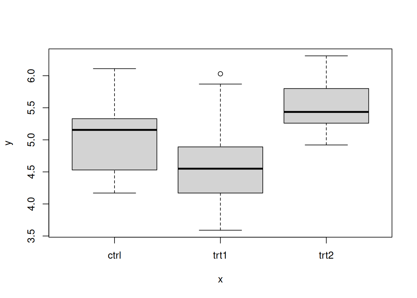
The R engine can detect the type of the given data and create suitable plots accordingly.
df <- PlantGrowth # Load the data

plot(df$weight) # scatter plot of values in the order they appear
plot(df$group) # bar plot of frequency of each level
plot(x = df$group, y = df$weight) # boxplot for values of each level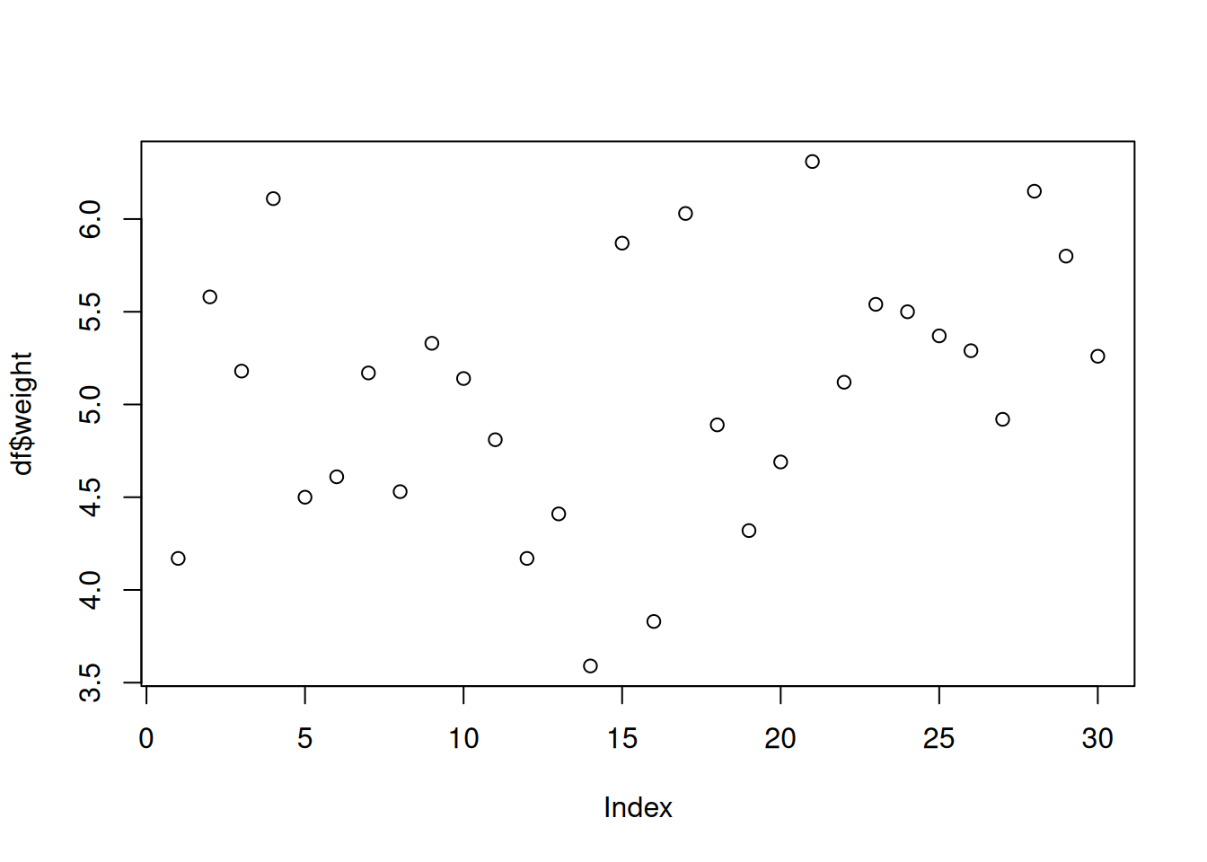
Expansion
For charts like scatter plots, this gives us a nicer look because points are not located at the edge of the plotting area this way. To know more about this topic, check the following websites.
- https://schmidtpaul.github.io/dsfair_quarto/ch/summaryarticles/ggplot2intro.html#expand
- https://3mw.albert-rapp.de/p/change-axes-expansion
Miscellaneous
Does the order of the function call matters?
Usually it doesn’t. Only the order of the geom functions (e.g. geom_abline()) may influence the result.
How to add a photo for \(x\) tick?
Use ggtext
External resources
ggplot2official- [About Facets]https://teunbrand.github.io/ggh4x/articles/Facets.html