rm(list=ls())Quantile-Quantile Plots
Explanations on when or why to use quantile-quantile plots, along with examples in R.
About Quantile-Quantile Plot
The Q-Q plot, or quantile-quantile plot, is a graphical tool used
either to assess if a set of data came from some theoretical distributions, such as normal distribution and exponential distribution. E.g., if we run a statistical analysis that assumes that a variable is Normally distributed, we can use a Normal Q-Q plot (also called normal probability plot) to check that assumption.
or to assess if two data sets came from the same type of theoretical distribution.
A Q-Q plot is a scatter plot created by plotting two sets of quantiles against one another. If both sets of quantile came from the same distribution, we should see the points forming a line that’s roughly straight.
Note
A Q-Q plot provides a visual check only, not an air-tight proof. The interpretation of the resulting graphs is somewhat subjective.
How to construct a Q-Q plot
Below is the construction of a normal Q-Q plot using \(n\) values.
Step 1: Re-arrange the data
First of all, we re-arrange the data from smallest to largest. –> x(1), x(2),...,x(n) The sample values are considered to be estimates for quantiles (p-Quantile) of the population that they came from. That means, each value is considered to represent a particular proportion (p) of values in the population that are smaller than or equal to the given value. It is assumed that the values of the samples are approximately representing quantiles that divide the distribution they came from into \(n+1\) parts that represent equal proportions of the population.
Step 2: Determine the proportion distribution
Determine the proportions that the values are considered to represent assuming that they came from a normal distribution.
Simple approach
Consider a normal density curve, with the area under the curve representing 100% of the population (i.e. proportion = 1). In case we would have \(n\) sample values in our data set, we would divide the area under the curve into \(n+1\) parts. The parts would have to be chosen in a way that all parts represent equally sized proportions of the distribution. In other words, each part would represent a proportion of \(1/(n+1)\) of the values.
- \(x(1) =\) p-Quantile with \(p=1/(n+1)\)
- \(x(2) =\) p-Quantile with \(p=2/(n+1)\)
- …
- \(x(n) =\) p-Quantile with \(p=n/(n+1)\)
Alternative approach
Instead of using \(i/(n+1)\) to approximate the proportion values, there is a variety of other possibilities, such as \((i-1/2)/n\), or more generally \((i-a)/(n+1-2a)\), with a being a number between \(0\) and \(1/2\). In dependence of the sample size R uses different values for \(a\).
Step 3: Plot the observations
After determining the proportion distribution, we use the proportion values in order to determine the corresponding p-Quantiles from a standard normal distribution. Finally, we plot the observations (= p-Quantiles from the population) against the corresponding p-Quantiles from a theoretical standard normal distribution (= expected z-scores for the observations).
Q-Q plot in R
Create a univariate data set. Here we are going to use the finishing times of a race dog called “Barbies Bomber”.
barbVec <- c(31.35,32.52,31.26,32.06,31.91,32.37)Construct a normal Q-Q plot (also called normal probability plot)
sortBarb <- sort(barbVec)
l <- length(sortBarb)+1
propBarb <- 1
for(i in 1:l) propBarb[i] <- i*(1/l)
exZscore <- qnorm(propBarb)
qqplot(exZscore[1:6],sortBarb)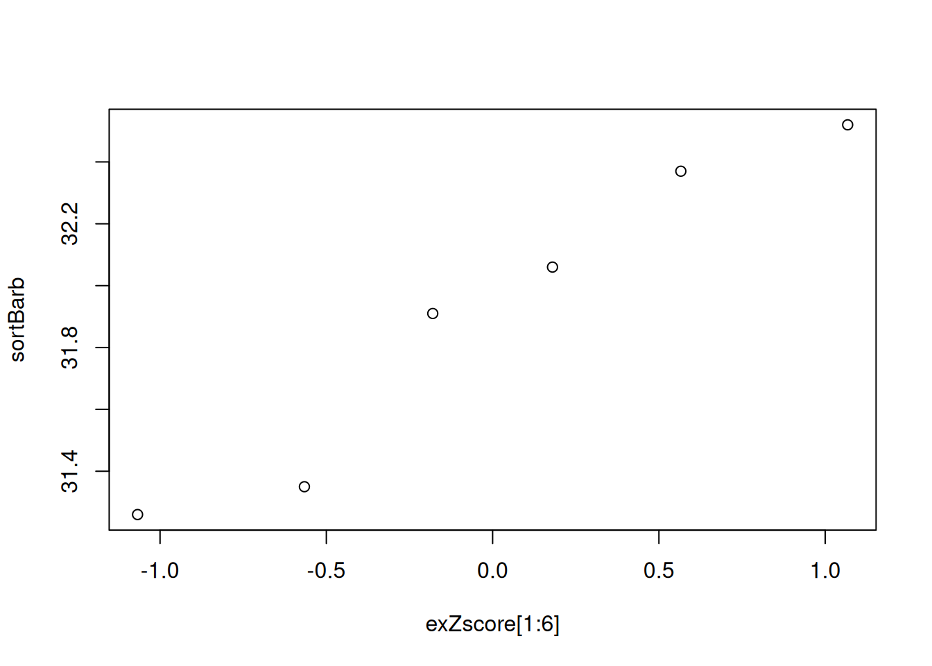
The qqnorm() method covers it all
qqBarb <- qqnorm(barbVec)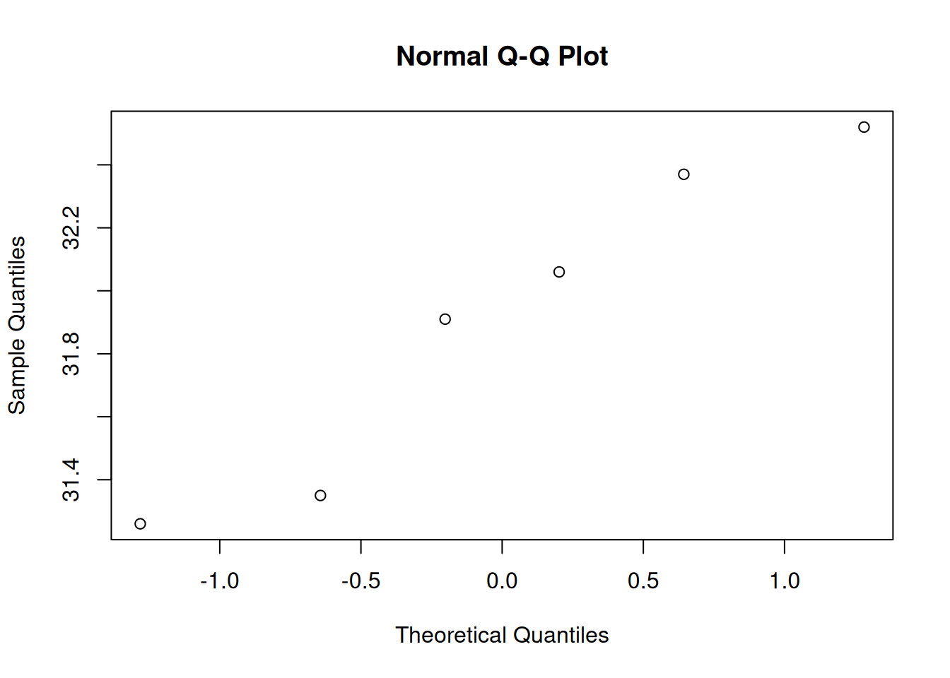
qqline() provides a line for perspective. It draws a line that intersect with the first and third quartile.
qqnorm(barbVec)
qqline(barbVec)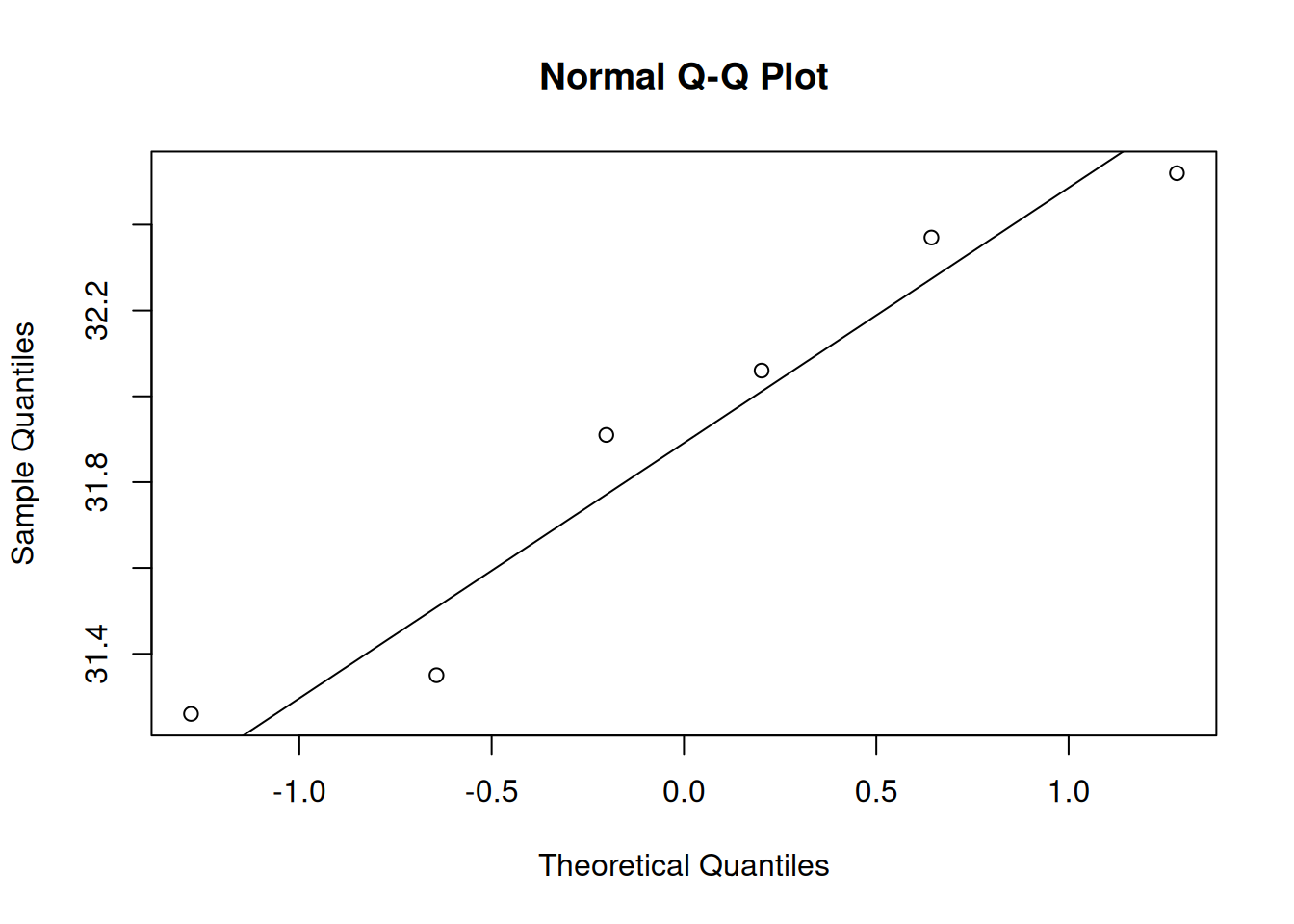
alternatively one can draw a regression line
qqnorm(barbVec)
abline(lm(qqBarb$y~qqBarb$x), col="red")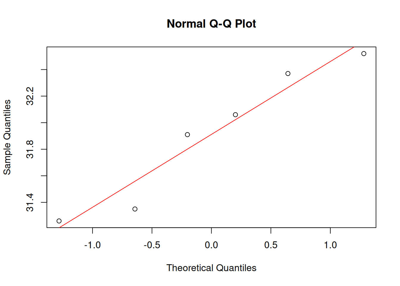
Note
qqplot() produces a Q-Q plot of two datasets. It allows to assess if they came from the same type of distribution
Simulate a sample data set from a standard normal distribution
vec <- rnorm(6)plot the finishing times against the simulated data
qqBarb2 <- qqplot(vec,barbVec)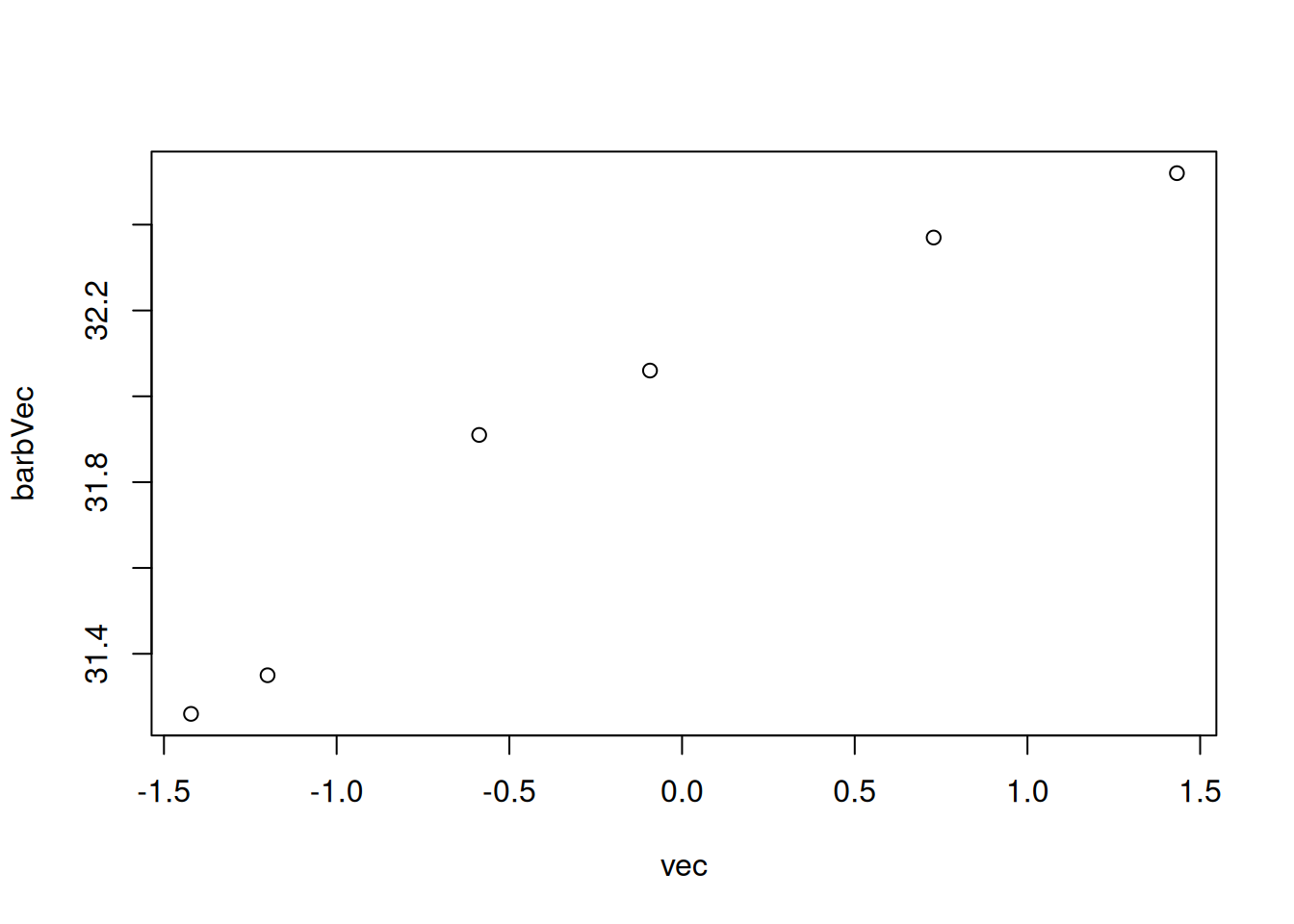
abline() performs better than qqline().
qqnorm(barbVec)
qqline(vec)
qqline(barbVec)
abline(lm(qqBarb2$y~qqBarb2$x), col="red")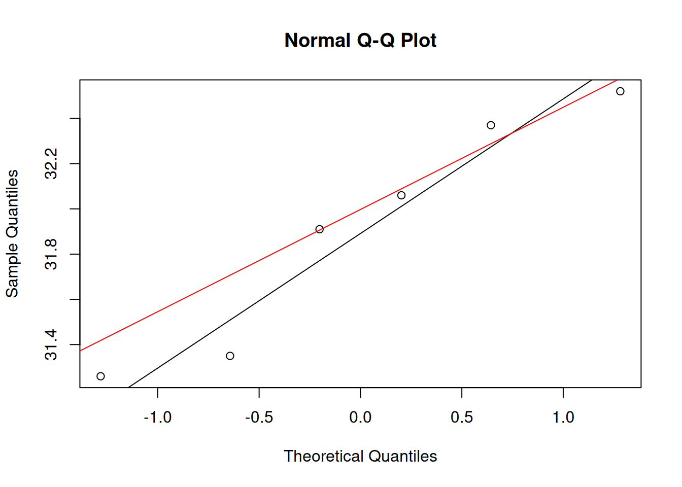
qqBarb2$x
[1] -1.42165574 -1.19999169 -0.58738765 -0.09278186 0.72848673 1.43275465
$y
[1] 31.26 31.35 31.91 32.06 32.37 32.52Compare two simulated data sets (using rnorm())
vec1 <- rnorm(6, 25,4)
vec2 <- rnorm(6, 65,12)
qqDat <- qqplot(vec1, vec2)
abline(lm(qqDat$y~qqDat$x), col="red"))-1.png)
Compare two simulated data sets (using runif())
vec1 <- runif(6)
vec2 <- rnorm(6, 65,12)
qqDat <- qqplot(vec1, vec2)
abline(lm(qqDat$y~qqDat$x), col="red"))-1.png)
Compare two simulated data sets (using rexp())
vec1 <- rexp(6)
vec2 <- rnorm(6, 65,12)
qqDat <- qqplot(vec1, vec2)
abline(lm(qqDat$y~qqDat$x), col="red"))-1.png)